Q: How do you know when a design is finished?
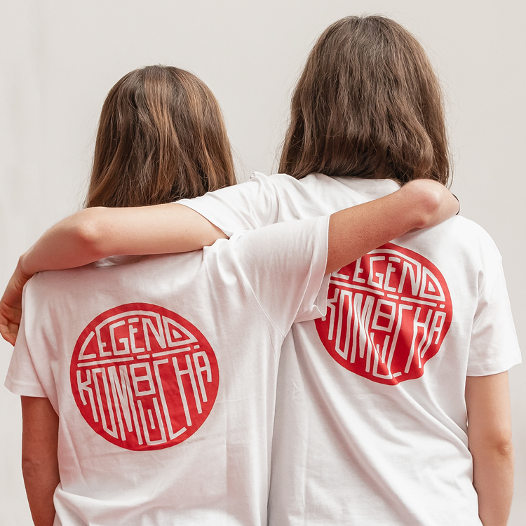
A: When you want to put it on everything.
Launching
A LEGEND
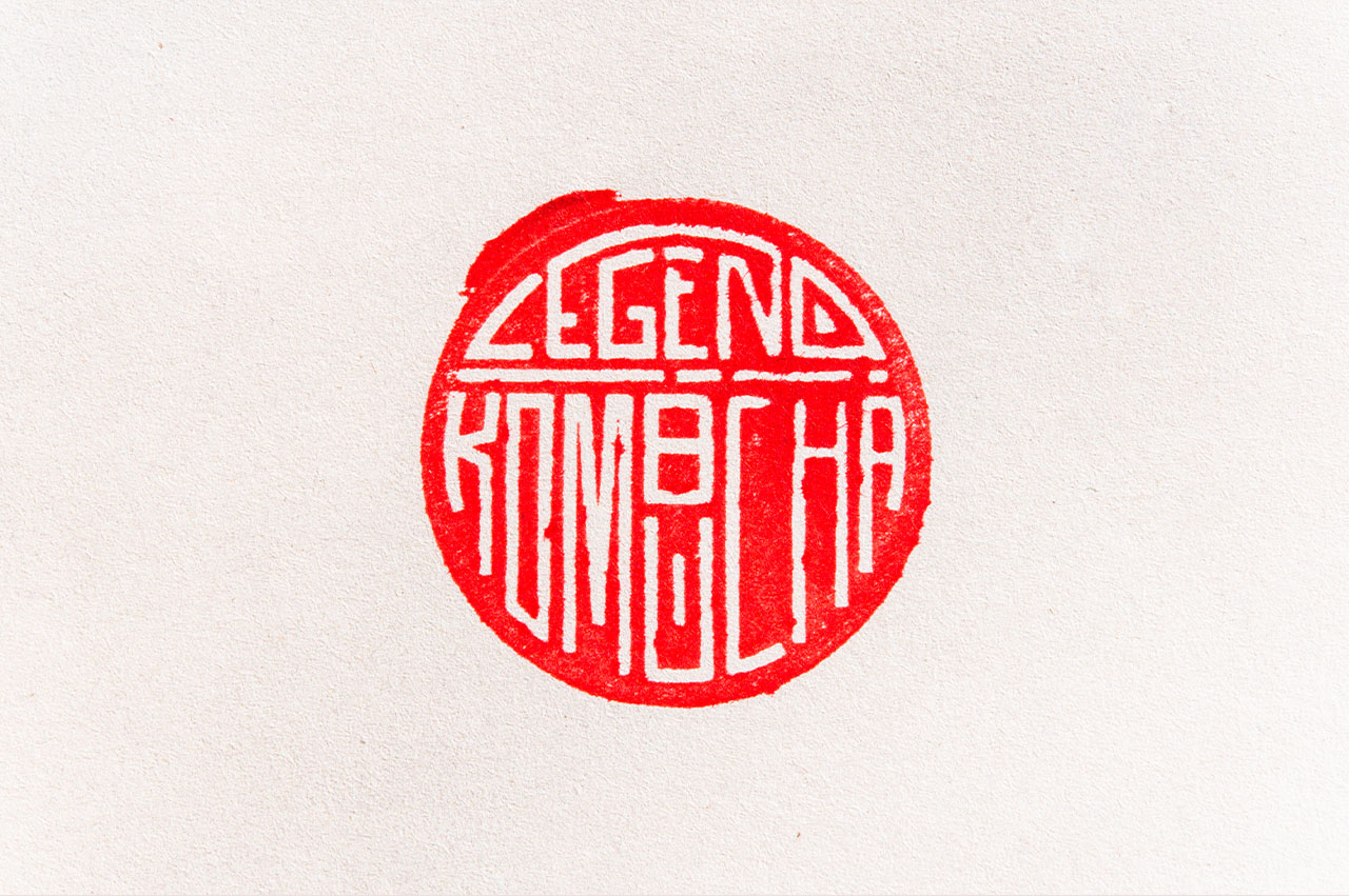
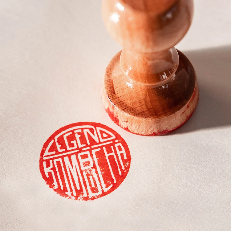
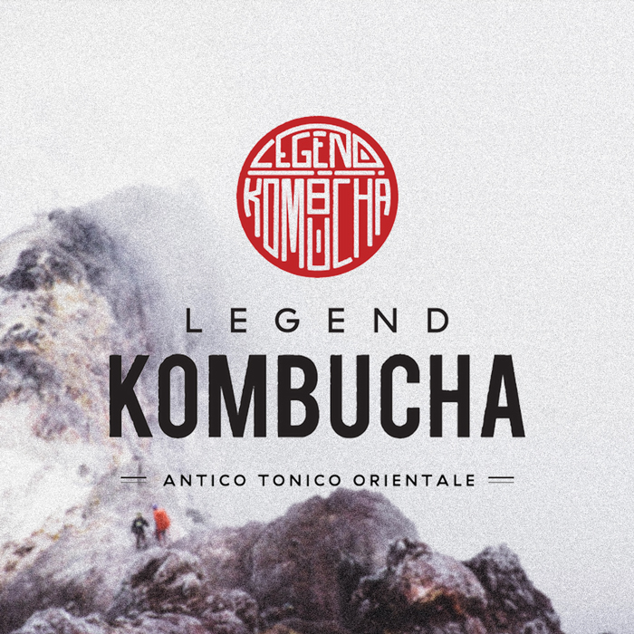
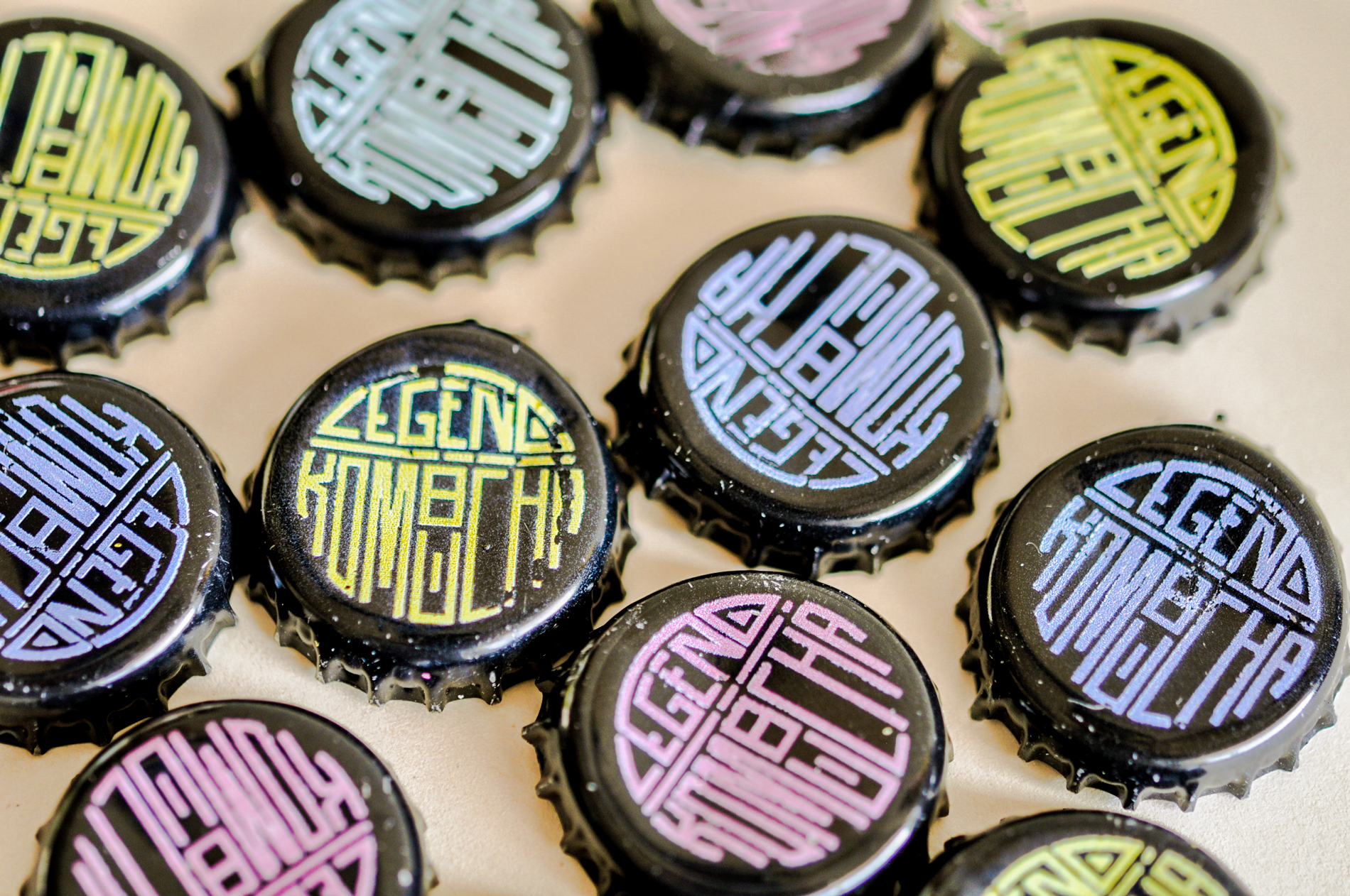
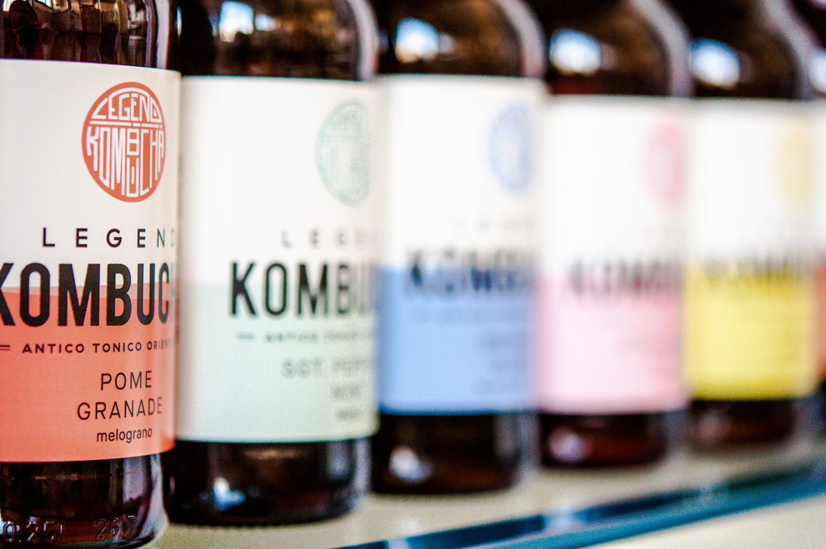
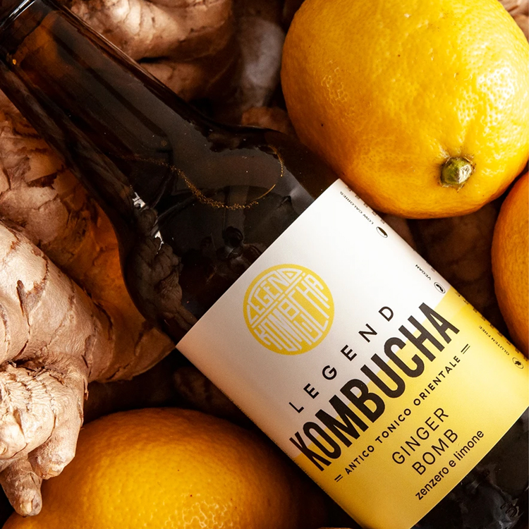
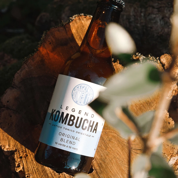
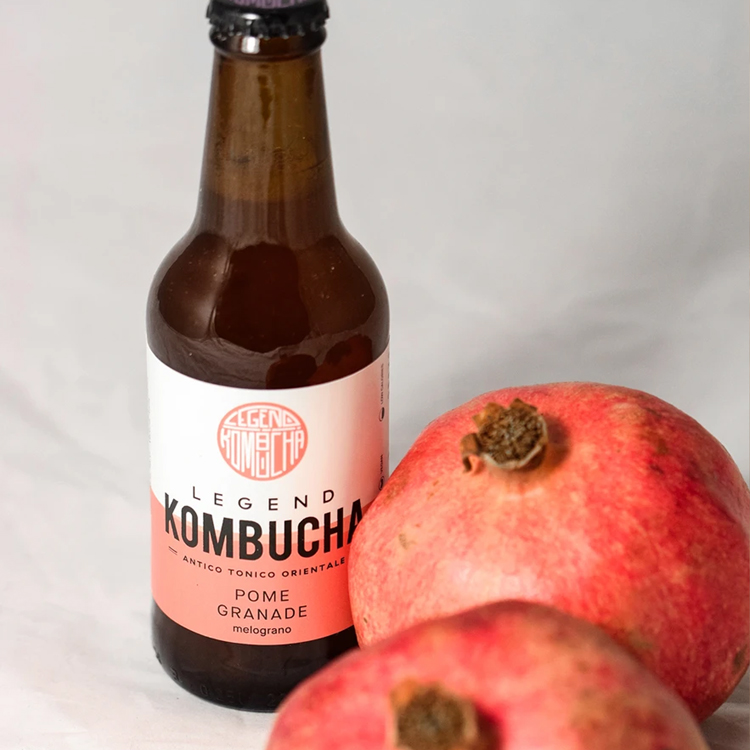
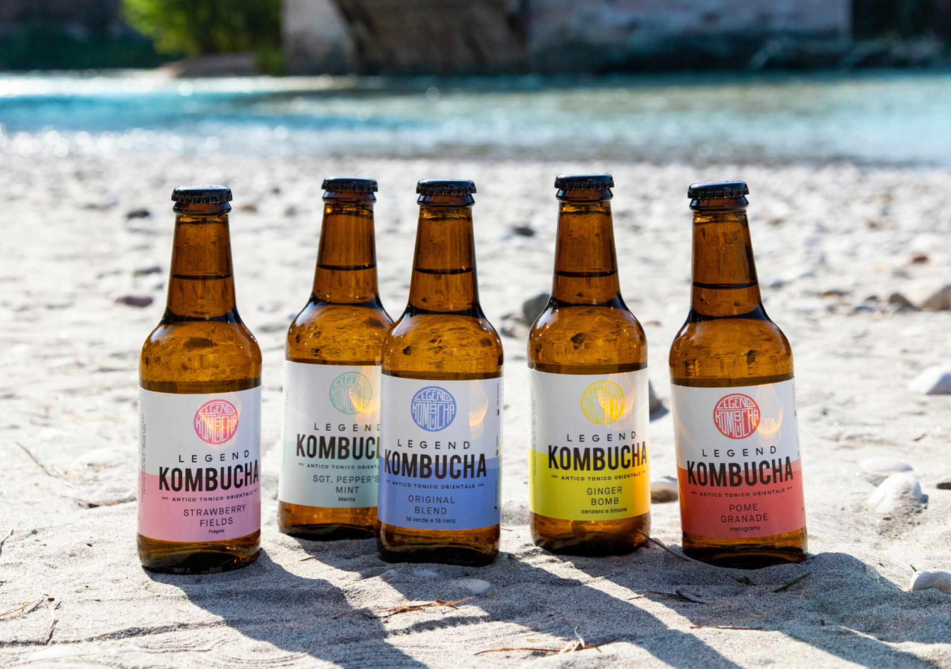
A standout logo that links back to the origin of Kombucha itself. The icon, a chop*, is a nod to the brand's respect for the legend of Kombucha – originally a drink for samuri warriors. Then the identity was expanded into a colorful labeling system: The packaging's visual system needed to be easily expansive as the company launches new flavors and grows. AND because the brand was launching in a virtually new market, the label needed to be informative, but not overcrowded. A 50/50 split of color and logo in white space, plus fun icons on the bottle, with just the right balance made this design the perfect foundation for Legend to launch.
*fun fact: the initial chop logo concept was sketched on a napkin.

Case Studies

VESSLProject type
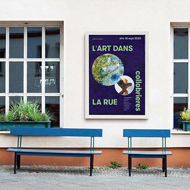
L'Art dans la RueIdentity Design

Roche StudioBrand Refresh
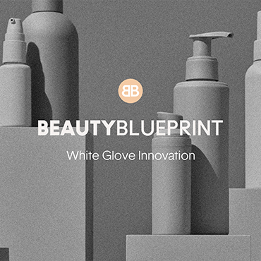
Beauty BlueprintBrand Identity, Web Design & Development

LUREBrand Identity

TO&FROMBrand Identity
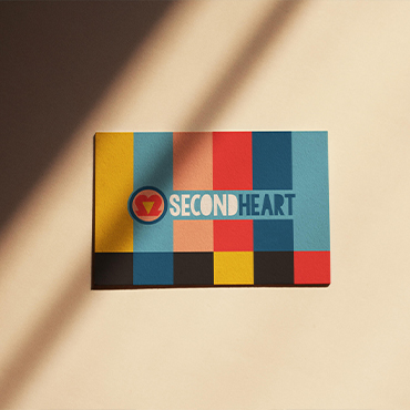
SecondHeartBrand Identity

JSA StudioBrand Identity
For project inquiries and more information, please get in touch via email at hi@donatelli.studio
DONATELLI STUDIO is a branding, packaging and web development practice led by Juliette Donatelli.